
Improving the discovery of Payment Page settings

Background
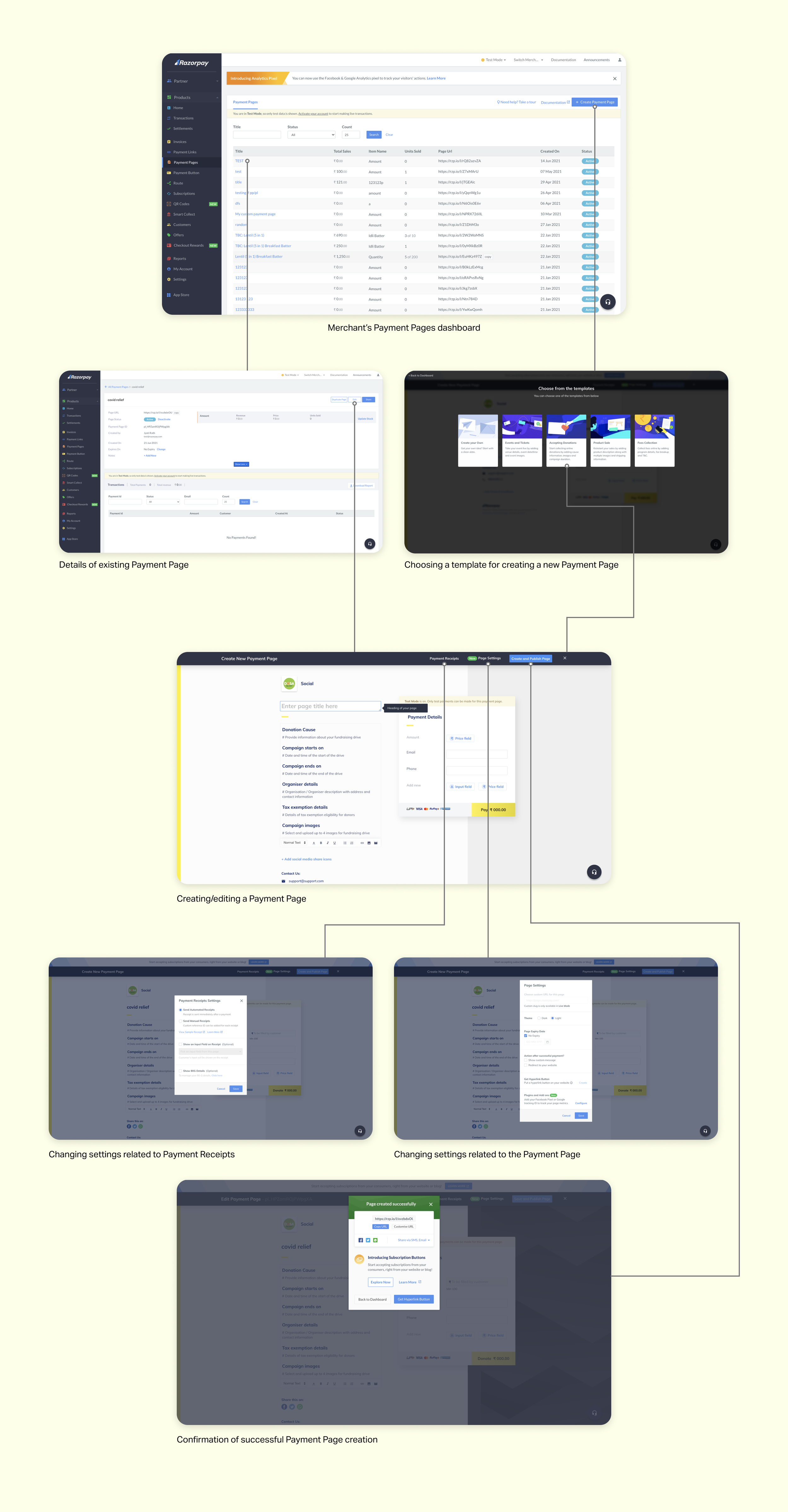
Razorpay Payment Page is a product that helps small businesses easily collect payments from their customers through a custom hosted webpage. Use cases: selling products/tickets; collecting fees/donations
Problem
User Problem: Merchants were having trouble finding and changing various settings of their Payment Page
Business Problem: Rise in support tickets
Solutions
/ Nudging the merchant to explore Settings after they publish their new Payment Page successfully
/ Adding a Settings button for the Payment Page details page on merchant dashboard
/ Enhancements in UX copy in Settings modals
Impact
~50% reduction in support tickets from 10.8 tickets/1K Monthly Transacting Users (MTU) to 4.8 tickets/1K MTUs within 3 months (staged rollout)
My role
I led the design of this project from end-to-end. I redefined the success metrics based on ticket analysis and leveraged internal data to deep-dive into merchant usage patterns before between iterating and prototyping solutions. I was supported by a wonderful team who enabled every data request of mine, collaborated on reading tickets, and gave me rich feedback at various stages.
My team <3
Gautham Varma (Product Manager) • Rahul Makhija (FE Developer) • Susan Abraham (Product Analyst) • Vinod Kumar (Designer - supported on ticket analysis & UI iterations for receipt settings modal)
Before
After
Deep dive into support tickets
Collaboratively analyzed over 300 merchant tickets across 3 months to understand user problems.

Understanding the extent of problems raised through tickets and prioritising which ones to solve also helped me define success metrics for the project. There were 10.8 tickets being raised per 1000 merchants per month. We aimed to bring that down to at least 7 tickets per 1000 merchants per month.
Insight #1
Multiple different user problems were discovered. Overarching theme of the majority were questions emerging out of merchants’ not knowing how or where to change certain Payment Page settings.
How might we improve the discoverability of settings of Payment Pages for merchants?
Existing merchant journey
Analyzing merchant usage data
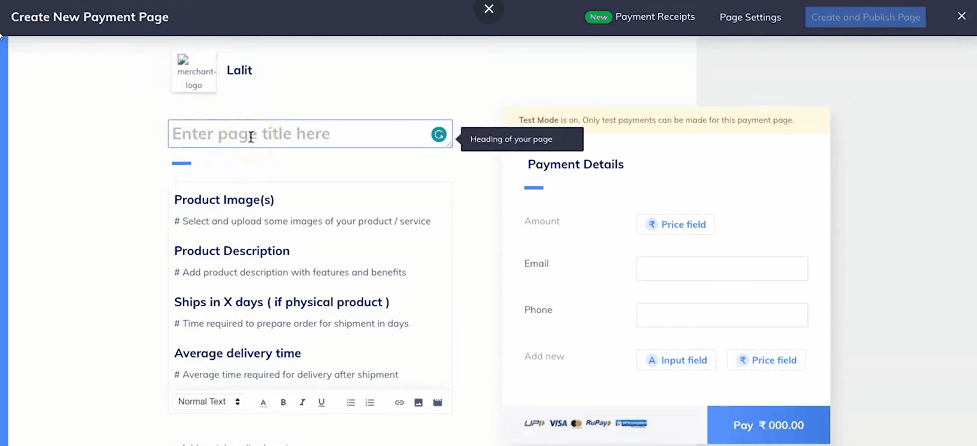
Analyzed Hotjar recordings of 8 merchants creating a new Payment Page to study their usage of Settings.
Insight #2
Only 2/8 merchants explored Receipt & Page Settings while creating a new Payment Page
The amount of time a merchant dedicates to creating a page is high, spending ~15-20 minutes to make sure their content is perfect. So any nudges to open settings during this flow will likely overwhelm the user and delay Page creation.
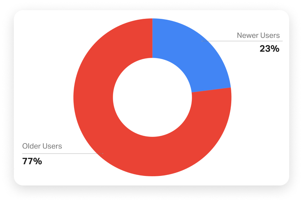
With the help of the Product Analyst, we did a Keyword Analysis of various Payment Page Settings within support tickets to understand what Settings were mentioned the most. I also analyzed the types of merchants who were raising these tickets.


Insight #3
60% of merchants who raised these tickets are Monthly Transacting Users which means that they have already accepted payments via their Payment Page from customers.
77% are not new users of Payment Page i.e. they raised the ticket after 20 days of creating their new Page.
This means that it is also important to have easy access to change their Page’s settings long after its creation.
The gratification of seeing their published Payment Page precedes exploring settings, which comes as an afterthought.
Studying competitor products

+ Nudges merchants to explore settings with tips on using the product better
+ Clean design - not overwhelming for user
– Too many options within settings. Difficult to understand where to navigate for switching on email notifications.
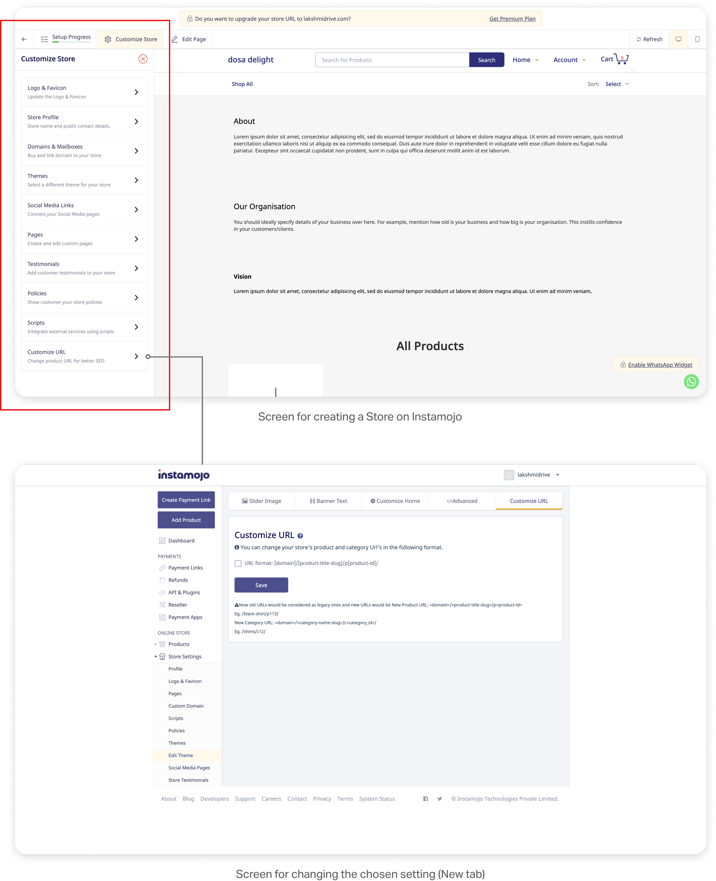
+ All settings are upfront during the creation of the product itself
– This will lengthen the time required to create the Store if they get distracted by various settings. This can lead to drop offs.
– The screen for configuring the settings opens in a new tab which breaks the creation flow of the user. Exploring various settings will results in opening too many tabs. This can lead to drop offs. The navigation is also distracting and overwhelming.
Discarded concepts
– Symptomatic solution. Can be easily missed and not remembered in need.
– Serves as a distraction in the creation flow. Possibility of increasing creation time leading to drop off.
– Serves as a distraction in the creation flow. Possibility of increasing creation time leading to drop off.
– Serves as a distraction in the creation flow. Possibility of increasing creation time leading to drop off.
– Having two ways to change settings can cause confusion. Information overload on Payment Details page.
Final solutions
Making the merchant aware of important default settings
Nudging the merchant to explore settings after Page creation
Highlighting most used/requested settings
Giving merchants the ability to change settings of their Page directly through their dashboard
Before
After
Improvements in UX copy to help merchant understand default settings and options with more clarity
